Smoked Olive
Grounded neutrals in gray/green can lift your spaces on days with less sun, especially in sunlit living spaces or bedrooms. Bringing weight, not brightness, these hues are earthy and can feel like being in a forest at dusk. We love how spaces come alive with a calm energy, and the darkest shades seem incredibly traditional.
Shown below are the hex color numbers, but you can consider Keim Interior Mineral Matte Paint colors from the Exclusiv collection such as #9382, #9385, #9345, #9351, or #9357.
FINISH
Matt mineral paint on walls, eggshell on trim in the same tone matched in a more durable finish.
#3E4232 #6B6A54 #A99B82 #D9CFBC #F2ECE1
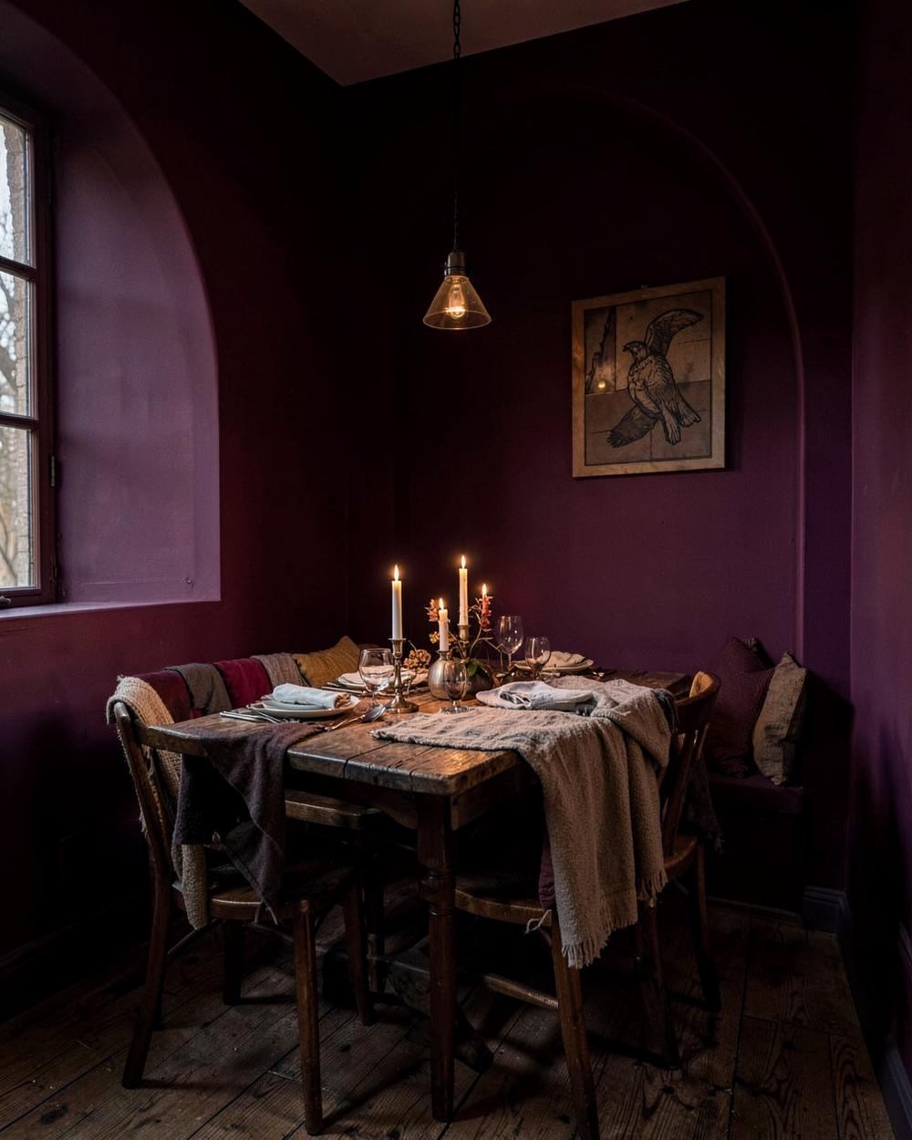
Shadowed Plum
If you love dramatic and unusual colors, this collection may be for you. These deeply tinted hues can be striking in a dining room or personal space like a library. And these colors color fully arrive after dark, when shadows and moody lighting enhance the sensational impact.
Shown below are the hex color numbers, but you can consider Sherwin-Williams colors such as SW6020 Marroned, SW6019 Poetry Purple, SW7525 Dhurrie Beige or SW6007 Smart White as alternatives.
FINISH
Dead flat walls are best in these lesser used, personal spaces, with ceilings painted out to match, for a full color drenching effect.
#3A2230 #5C3243 #8C6A63 #C4AC9A #EBE2D6
Burnt Clay
Warm enough for a hallway, grounded enough not to shout.
FINISH
Eggshell for wipeability; keep woodwork one shade deeper.
#6E3B29 #9C5B3C #C08A63 #DFC3A5 #F4EADD
Winter Chalk
The near-white that holds up against low, gray daylight.
FINISH
Matt walls, satin on doors, no brilliant white anywhere.
#4A4642 #8A837A #BFB6A8 #DED6C8 #F6F1E8
Moving from Fall to the Winter months, think of chalky off whites in warming tones, avoiding those with a gray undertone. And try embracing deep, dark colors too, to envelope a room in a cozy, warmth when it is icy cold outside.
Try these colors.
- #D7C5B3
- #EEECE3
- #806257
- #DAD2C6
- #A49689
- #756861
- #E6DDD4
- #E1D9C6
- #7A6841