The Midcentury Study
Custom bookcase and a moody whole-room color
- Location
- Private residence
- Scope
- Joinery reuse · Whole-room color · Built-in lighting
- Year
- 2026
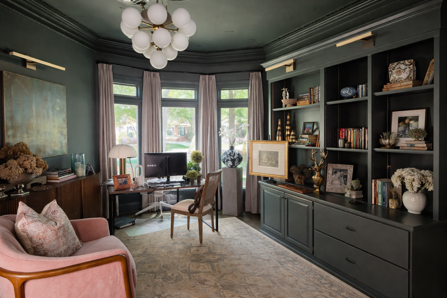
A moody and curated midcentury modern inspired study that feels like a haven. Using the owner's original maple cabinets to create a truly custom bookcase, that grounds the room's architecture with gravity and creates a stunning visual centerpiece.
The whole room — walls, ceiling and the back of the shelving — is carried in one deep charcoal blue-green, so the books, art and objects become the only color in the room. Reusing existing maple meant matching sheen rather than color: the cabinet fronts were degreased, primed with a bonding primer and finished in a satin that sits comfortably beside the flat walls.
The brief began with the client's collection, not the paint. A modernist print in a gilt frame, a large abstract oil, a carved horse, a hand-painted ceramic plate — pieces gathered over decades needed walls deep enough to make them glow, and quiet enough never to compete with them.
The color itself is one color, used in different sheens: flat on the walls and ceiling, satin on the moldings, medallion, bookcase and trim. As light rakes across the room, the sheens catch it differently and the architectural details read in relief — dimension and depth from a single can of paint.
And the room will never sit still. The client's art is continuously and fluidly changing — pieces rehung, swapped, and rearranged as new finds join the collection — while seasonal accents shift with the year around them. Nothing is fixed to the walls except the paint, and that was one of their requirements: a true gallery experience, a room deep and quiet enough to be rearranged a hundred times and always look finished.
Project story
06 photographs
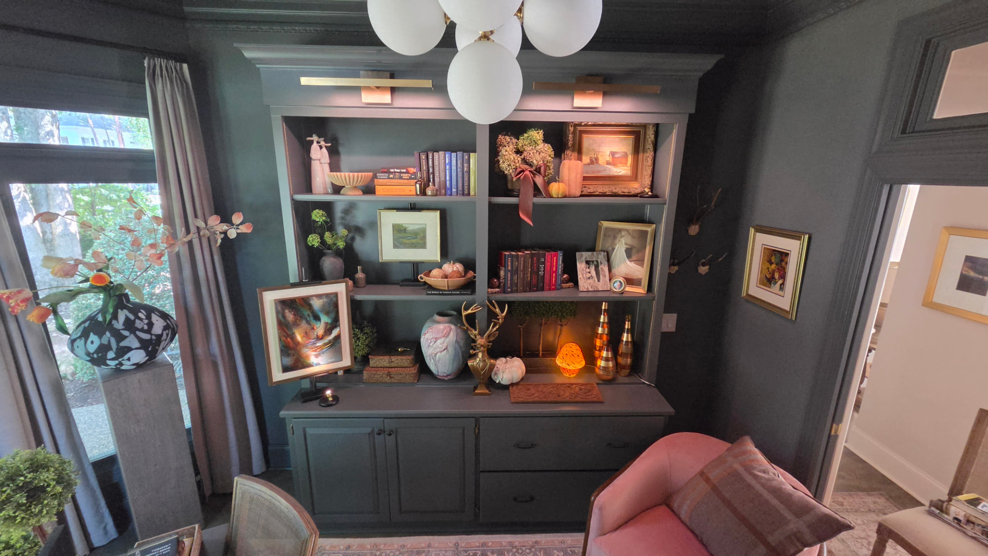
01 · Bookcase wall
The owner's original maple cabinets, rebuilt as a full-height bookcase. We anchored the units to the wall, added height and a crown to accommodate the new art lights and painted the cabinet in Farrow and Ball Downpipe to match all the trim and walls and ceiling.
02 · The room in full
The finished room. Everything in it belongs to the client — gathered over decades and finally given walls that let it lead.
The collection set the brief, not the paint. Once we knew what would hang here — the modernist print, the abstract oil, the ceramics and found objects — the color almost chose itself: deep enough to make the gilt frames and warm woods glow, quiet enough never to compete.
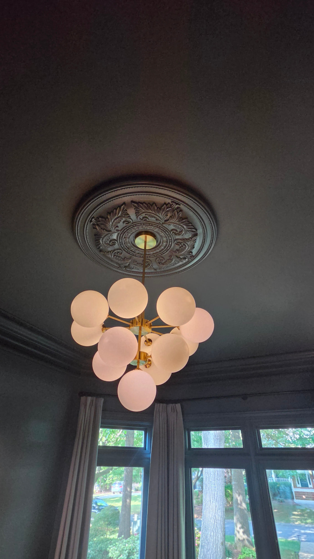
03 · Ceiling medallion
The medallion, the moldings and the ceiling are all the same color — what separates them is sheen.
This is where the dimension and depth come from. The broad fields — walls and ceiling — are dead flat, so light simply falls; the medallion, crown and casings are satin, so light catches their edges and ornament. One color in different sheens: as the sun crosses the bay window, the architectural molding reads in relief without a second color anywhere in the room.
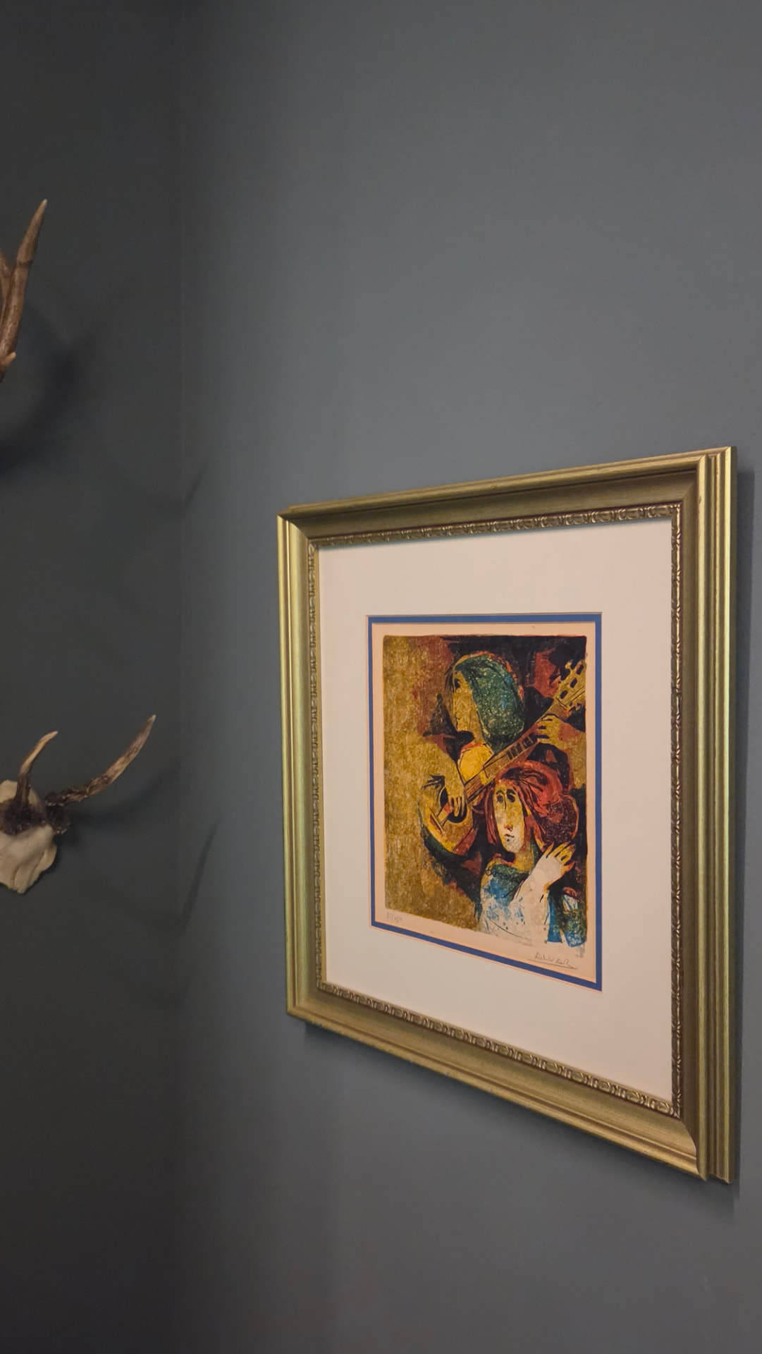
04 · The client's art
A modernist print in a worn gilt frame, hung beside the client's antler mount — the walls stay quiet so the art can be loud.
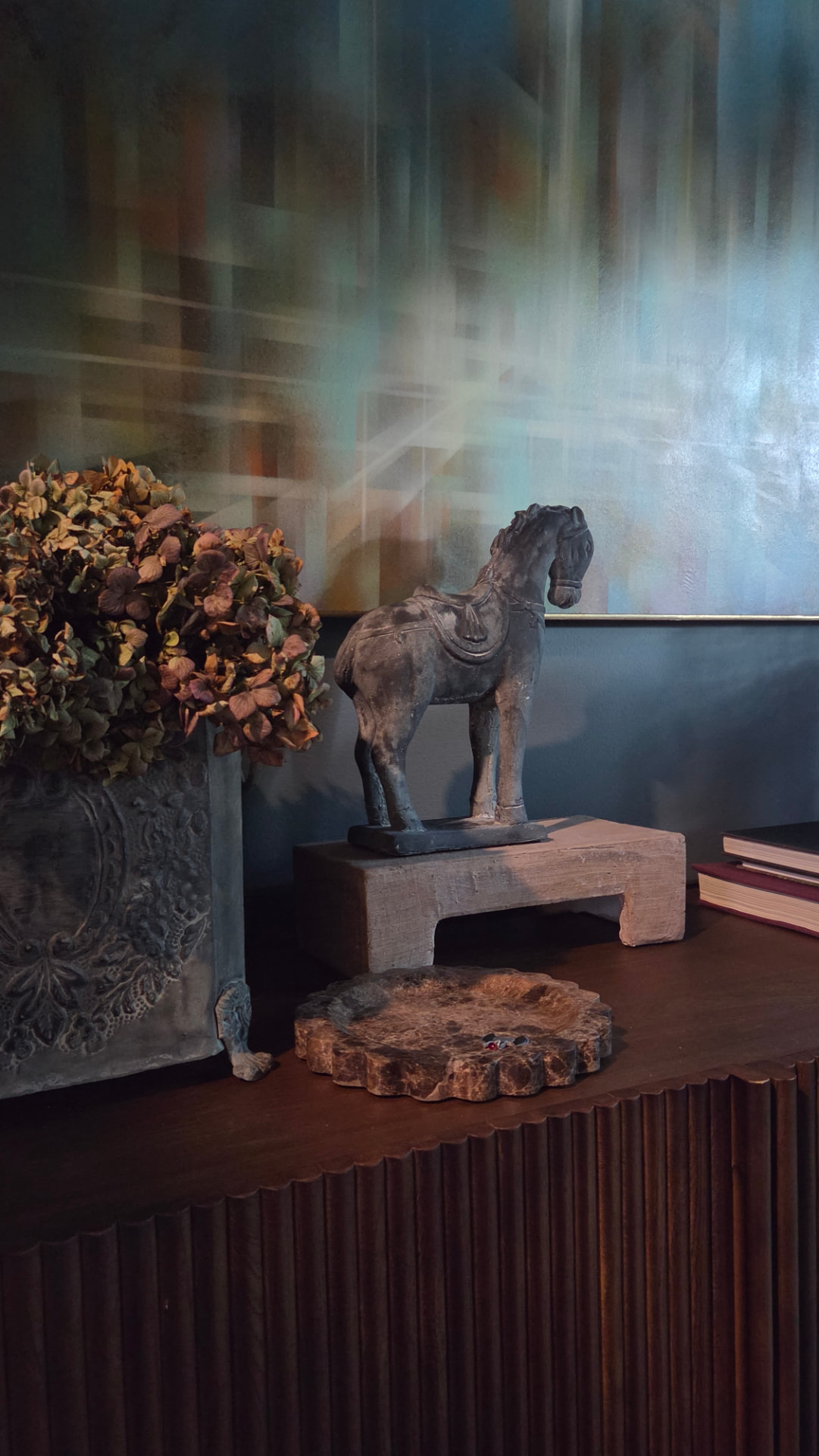
05 · Objects on the sideboard
The client's carved horse and dried hydrangeas on the fluted walnut sideboard, below the abstract oil.
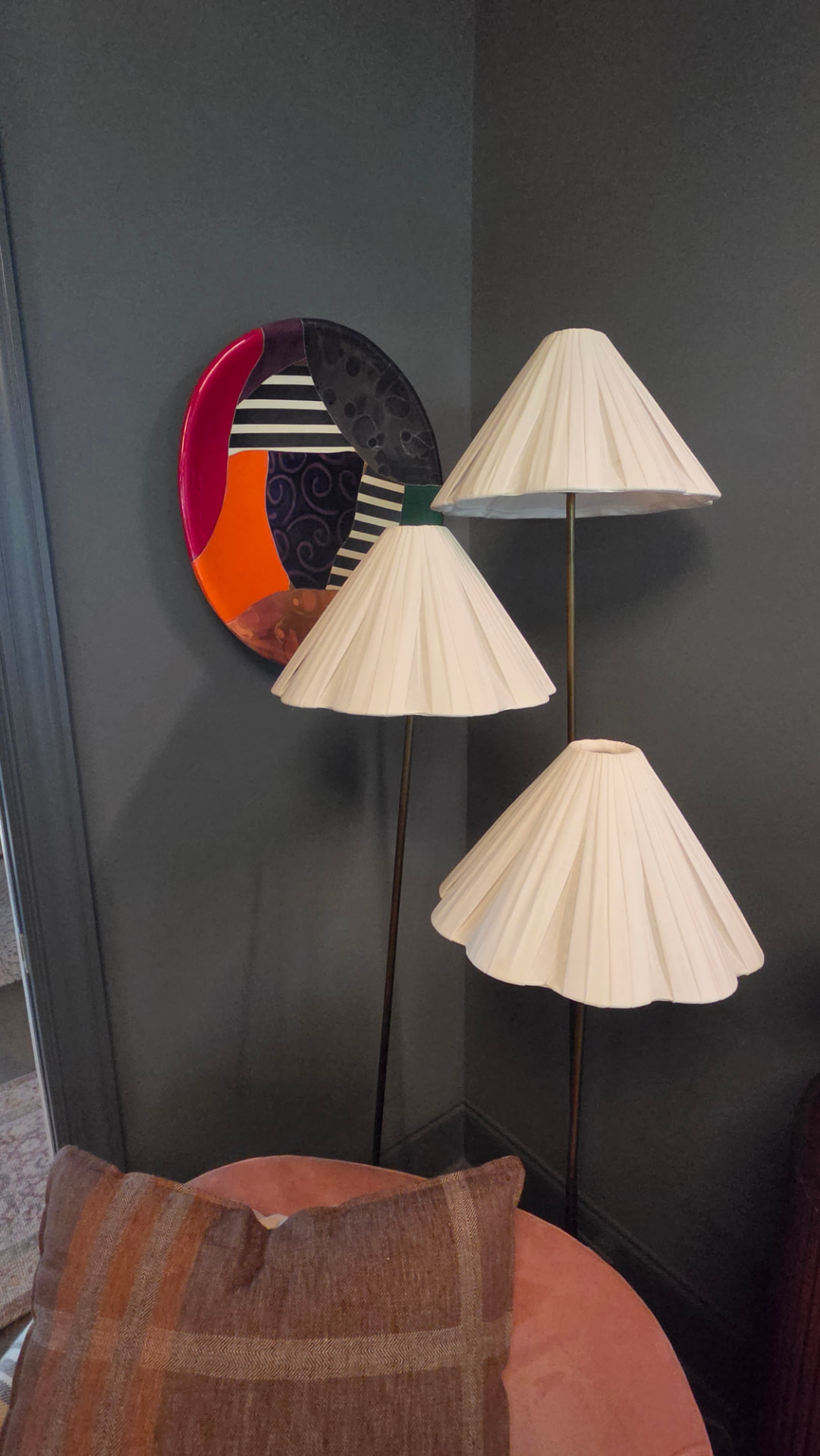
06 · Ceramic plate
A hand-painted ceramic plate between the pleated lampshades — the kind of piece only a collector thinks to hang.