A Welcoming Transformation
Entry and main hall — lime paint, a navy ceiling and a thread of blue
- Location
- Private residence
- Scope
- Mineral wall finish · Ceiling and trim color · Lighting and furnishings
- Year
- 2026
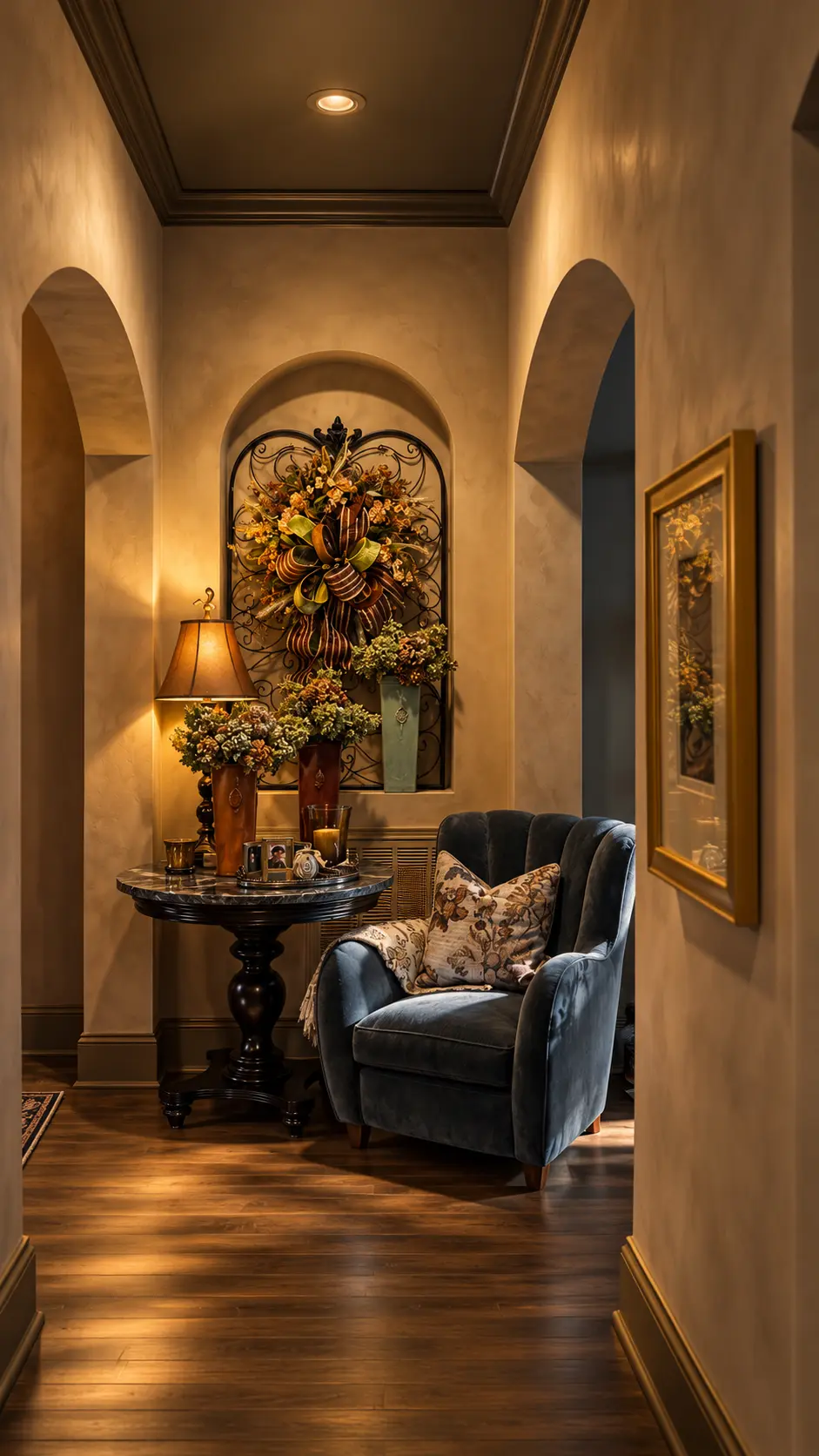
An entryway is more than a passage into a home. It is the first impression, the introduction to the home's personality, and an opportunity to establish the design language that unfolds throughout the interior.
For this project, the goal was not to reinvent the client's home, but to elevate what was already there. Beautiful artwork, meaningful furnishings, and distinctive architectural details provided the foundation for a transformation that feels both collected and intentional.
The result is a richly layered entry and main hall where natural mineral finishes, dramatic color, sculptural lighting, and carefully chosen textiles work together to create an atmosphere of understated sophistication.
The project in detail
The walls: a study in natural color and texture
The most transformative element of this project is also one of the most subtle: the walls. Rather than selecting a conventional architectural paint, we chose Lime Wall Paint from JH Wall Paints, custom color-matched, to achieve a warm, earthy neutral that complements the home's existing architecture and furnishings.
Lime paint has a remarkable ability to give a room visual depth without relying on strong color or a glossy finish. Its softly variegated surface creates movement across the walls, responding beautifully to changes in natural and artificial light.
Throughout the day, the walls shift gently in appearance. In natural light, their mineral character and delicate tonal variations become more apparent. In the evening, warm ambient lighting brings out richer, almost velvety undertones.
This is one of the qualities I find most compelling about mineral-based finishes: color becomes more than a flat visual statement. It becomes an experience of light, texture, and material.
Beautiful by nature, healthier by design
The decision to use lime paint was about more than aesthetics. Traditional lime-based paints are made primarily from mineral ingredients, with lime serving as the principal binder, and their inherent characteristics offer several meaningful advantages:
- Naturally high alkalinity: Lime's elevated pH can discourage the growth of certain molds and microorganisms on the painted surface.
- Breathability: Properly formulated lime finishes are vapor-permeable, allowing moisture vapor to move through compatible wall assemblies.
- Low-emission potential: Mineral lime paints can be formulated with very low levels of volatile organic compounds, contributing to better indoor air quality.
- Mineral durability: Through carbonation, lime gradually reacts with carbon dioxide in the air to form calcium carbonate, producing a durable mineral finish.
These benefits depend on the specific formulation, substrate, and application conditions. Lime paint is not a substitute for proper moisture management, and the environmental footprint of lime production still needs to be considered.
Nevertheless, thoughtfully selected mineral paints can be an excellent choice for interiors where material authenticity, reduced emissions, and long-term performance matter. For me, sustainable design is most successful when the responsible choice is also the beautiful one.
A thread of blue: creating continuity through color
One of the guiding decisions in this redesign was the introduction of a recurring blue accent. Rather than repeating the same shade literally throughout the space, we used blue in different materials, values, and textures to establish a sense of continuity.
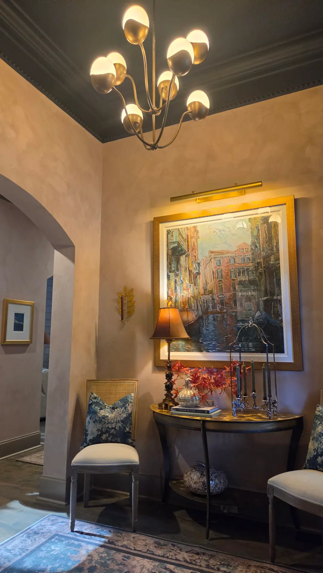
The entry ceiling is painted in Benjamin Moore Hale Navy, in a flat finish. This deep, sophisticated blue creates an intimate architectural canopy overhead, drawing attention to the room's proportions and beautifully detailed crown molding. Flat paint was an intentional choice: by minimizing reflected light, the ceiling reads as a rich, uninterrupted plane of color, allowing the warm walls and metallic lighting to take center stage.
That blue is echoed in the new velvet chair from the Pierce & Ward Collection at West Elm. Its generous, softly rounded silhouette adds a welcome sense of comfort to the hall, while the plush upholstery introduces a luxurious counterpoint to the mineral walls and polished furnishings.
The third expression of blue appears in the entry rug, selected from the Joon Loloi x Lone Fox collaboration. Its tapestry-inspired pattern incorporates softened blues alongside warm neutrals and muted earth tones, bridging the ceiling and upholstery while grounding the composition.
This repetition is what makes the palette feel cohesive without becoming overly coordinated. The blue travels through the space, but each appearance offers a different experience: architectural and dramatic overhead, tactile and inviting in the chair, and patterned and understated beneath our feet.
The supporting neutral: Benjamin Moore Beachcomber
An often-overlooked element in a successful color palette is the relationship between wall color and architectural trim. For this project, we selected Benjamin Moore Beachcomber in ADVANCE Satin for the doors, baseboards, and other architectural trim.
Rather than introducing a predictable bright white, Beachcomber offers a deeper, warmer neutral that works in harmony with the lime-painted walls. Its satin sheen provides a restrained contrast against the matte, mineral character of the wall finish — a subtle change in reflectivity that defines the architectural elements without making them feel visually disconnected.
The choice of Benjamin Moore ADVANCE was as practical as it was aesthetic. Doors, baseboards, and trim are among the hardest-working surfaces in a home, regularly exposed to contact, scuffs, and everyday wear. ADVANCE is a waterborne alkyd paint engineered to cure to a hard, durable finish with excellent leveling properties, providing the smooth, refined appearance traditionally associated with oil-based enamels.
The satin finish offers an ideal balance: enough sheen to provide a cleanable, resilient surface, yet restrained enough to complement the soft, matte character of the adjacent lime-painted walls. It is a thoughtful pairing of materials, each selected for the demands of its particular surface.
It's a reminder that successful paint specifications consider not only how a finish looks, but how it will perform over time.
Honoring the existing: art and furnishings with a story
One of the most important aspects of this project was the decision to preserve and celebrate the client's existing artwork and furnishings. A beautifully designed home should reflect the people who live there, rather than simply represent a collection of newly purchased objects.
The client's art collection became an integral part of the updated design. Its varied subjects, colors, and frames contribute to the sense of history and personality that makes the home distinctive. Among the featured works is Venice, a serigraph by impressionist artist Marco Sassone.
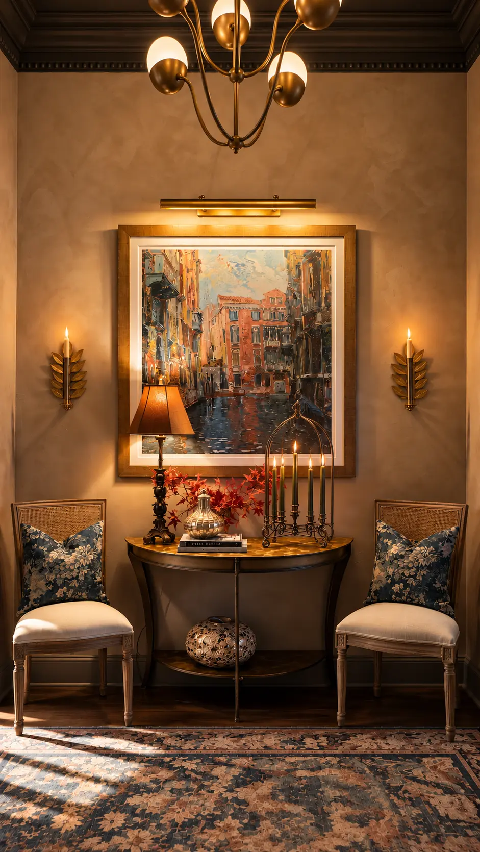
We installed a new picture light above the artwork, transforming it into a focal point within the entry. The warm illumination enhances the composition's architectural details, atmospheric colors, and reflections, while providing an additional layer of ambient lighting. The artwork also reinforces the overall palette, with its blues, ochres, and warm architectural tones echoing the colors found throughout the space.
An existing table, thoughtfully reimagined
Rather than replacing the hall table, we updated the existing piece with a new black quartzite top. The stone introduces a beautiful sense of permanence and material richness. Its dark surface anchors the surrounding artwork and decorative accessories, while providing a visual connection to the deeper tones of the ceiling and furniture.
It's a relatively simple intervention with a significant visual impact. Retaining and improving an existing furnishing also aligns with a broader philosophy of sustainable design: thoughtful reuse can be just as compelling as purchasing something new.
Lighting as jewelry for the architecture
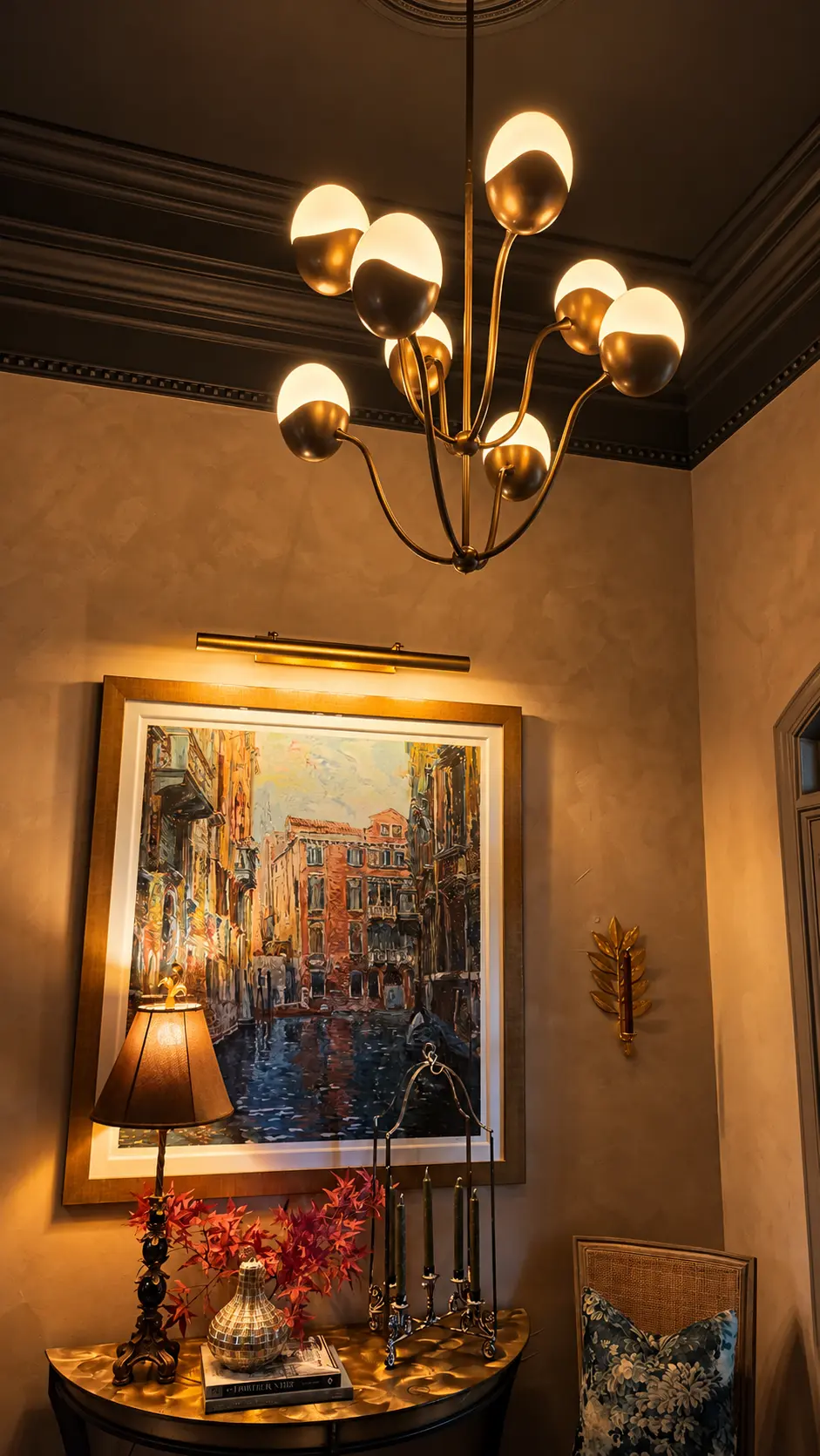
Lighting plays a particularly important role in spaces where natural light is limited or where an intimate, welcoming atmosphere is desired. For the entry, we selected the Primrose chandelier from Crate & Barrel. Its sculptural form and softly glowing globes introduce a contemporary element that contrasts beautifully with the more traditional architectural details and collected furnishings.
The chandelier is both functional and decorative. Its warm light brings out the nuanced surface of the lime-painted walls, while its metallic finish complements the gold and brass accents found in the artwork, accessories, and surrounding furniture. Combined with the new picture light, table lamps, and decorative candlelight, it contributes to a layered lighting scheme that makes the space particularly inviting in the evening.
Designing for mood: the importance of lighting control
Equally important to the selection of the fixtures was the decision to place all electric lighting on dimmers, giving the homeowners complete flexibility in how they illuminate and experience the space. Lighting should never be static. The needs of a home change throughout the day, and a successful lighting design should respond just as effortlessly.
During daylight hours, subtle supplemental illumination can gently enhance the artwork and architectural details without competing with natural light. In the evening, lowering the chandelier and surrounding lights creates a warmer, more intimate atmosphere, allowing the mineral walls to reveal their softer tonal variations.
When entertaining, the lighting can be adjusted to welcome guests with a sense of occasion, highlighting the artwork and decorative elements while maintaining a comfortable, flattering ambiance. And during quieter moments, the light levels can be reduced to create a peaceful, almost candlelit environment.
The ability to control light is, in many ways, the ability to control how color and architecture are experienced. A beautifully chosen wall color can take on an entirely different personality as the intensity and direction of light change. For a project centered on the subtle depth of natural mineral finishes, this level of lighting control was especially important.
A collected interior, not a decorated one
What makes this project successful is not any single material or furnishing, but the relationship between them. The warmth of the lime-painted walls softens the architecture. Hale Navy introduces drama without overwhelming the space. Beachcomber provides a quiet transition between surfaces. Slate blue velvet and a tapestry-inspired rug introduce comfort and pattern, while the black quartzite brings a grounding note of contrast.
Existing art and furnishings remain central to the story, ensuring that the refreshed interior feels personal rather than newly assembled. And with fully adjustable lighting, the atmosphere can evolve throughout the day, from a bright, welcoming entry to an intimate evening setting.
This is the distinction between a room that has simply been decorated and one that has evolved thoughtfully over time.
The RHS Atelier and Home perspective
I have long believed that color is most powerful when considered alongside the material that carries it. A color applied in a conventional acrylic paint will not necessarily have the same visual character when expressed through a mineral finish. The binder, surface texture, light reflectance, and application technique all influence how we perceive the finished result.
This project illustrates that principle beautifully. The lime-painted walls are not merely a backdrop. They are an active part of the design, creating the warmth and tonal complexity that allow the other elements to shine. Just as importantly, the project demonstrates how material performance, lighting control, and thoughtful reuse can become essential parts of the design process rather than afterthoughts.
By combining natural finishes with existing artwork, thoughtfully reused furnishings, carefully selected new pieces, and adaptable lighting, we created an entry that feels welcoming, elegant, and distinctly personal.
Good design does not always require starting over. Sometimes, it begins with seeing what is already there in a new light.
Project design notes
| Element | Selection |
|---|---|
| Walls | JH Wall Paints Lime Wall Paint, custom color match |
| Entry ceiling | Benjamin Moore Hale Navy, flat finish |
| Doors, baseboards and trim | Benjamin Moore Beachcomber, ADVANCE satin |
| Accent chair | West Elm, Pierce & Ward Collection, slate blue velvet |
| Entry rug | Joon Loloi x Lone Fox, tapestry design |
| Hall table | Client's existing table, updated with a black quartzite top |
| Entry chandelier | Crate & Barrel, Primrose |
| Featured artwork | Venice, serigraph by Marco Sassone |
| Art lighting | Newly installed picture light |
| Lighting controls | Dimmers on all electric lighting for adjustable ambiance |
Project story
07 photographs
01 · The main hall
A thread of blue carries through the hall: velvet upholstery beneath a deep ceiling, softened by the movement of the lime-painted walls.
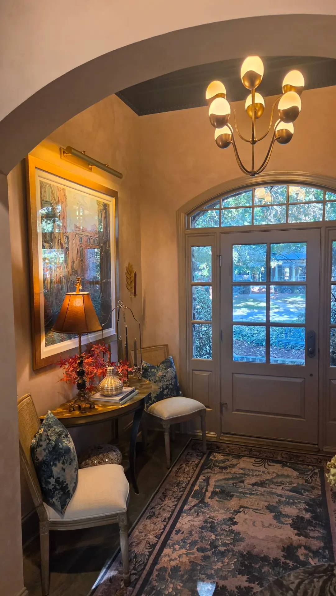
02 · A welcoming entry
The arch frames the first impression — Beachcomber trim, a patterned blue rug and the client's art bring warmth and continuity to the entry.
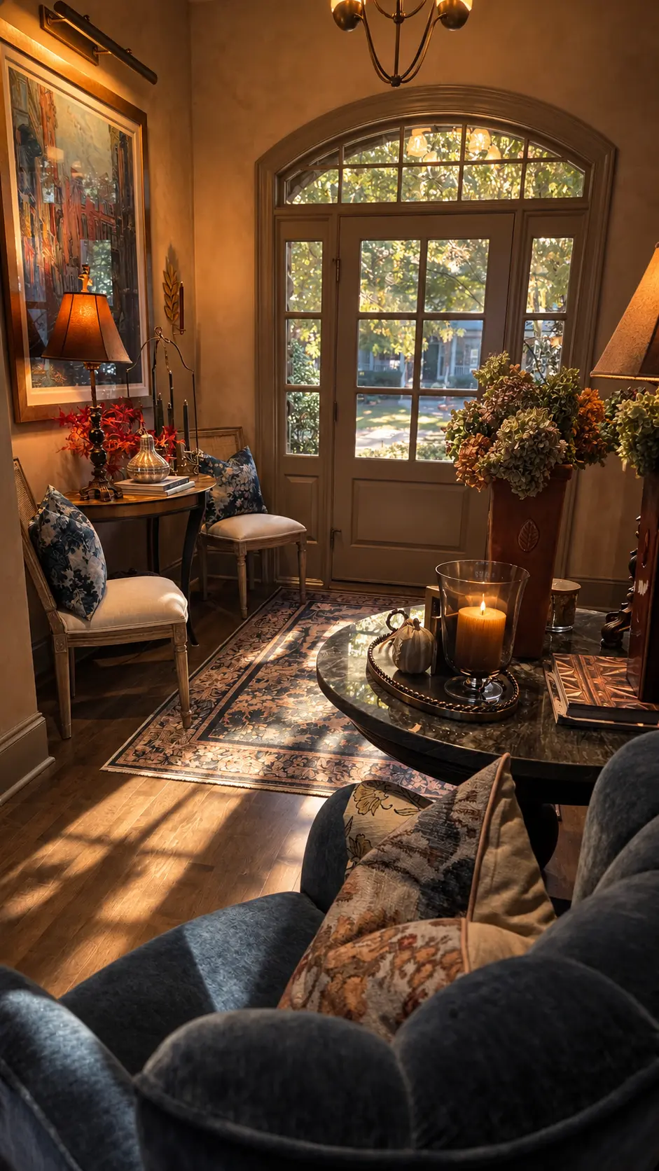
03 · The room in daylight
Daylight travels across the rug and mineral walls, revealing a different side of the same palette as the blue chair connects entry and hall.
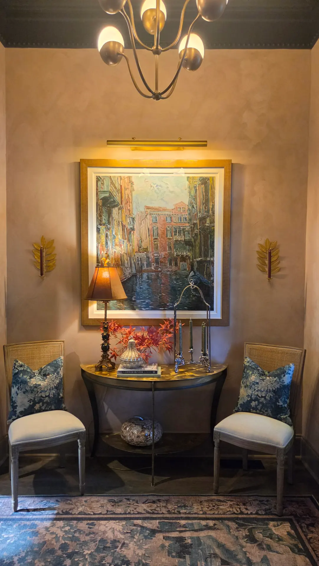
04 · Art as the starting point
Venice by Marco Sassone takes center stage. Its blues and warm architectural tones find echoes in the rug, cushions and softly variegated walls.
05 · Architecture and sheen
Beachcomber's restrained satin sheen defines the arch and trim against matte lime-painted walls; the flat Hale Navy ceiling adds depth overhead.
06 · An evening welcome
Picture light, lamplight and candles layer the entry in a warm evening glow, bringing richer undertones to the mineral finish without changing the palette.
07 · Lighting as jewelry
The Primrose chandelier becomes jewelry for the architecture, its softly glowing globes linking the brass picture light, gilt frame and seasonal accents below.